Limix-plot’s documentation
Plotting library for genetics.
Consensus curve
-
class
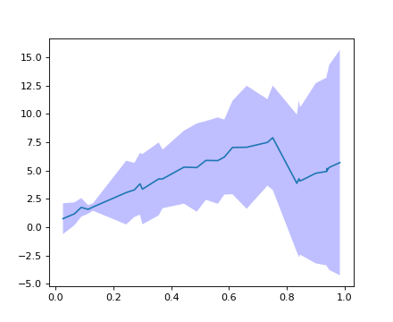
limix_plot.ConsensusCurve[source]¶ Consolidate multiple curves in a single one.
Example
>>> import limix_plot as lp
>>> from numpy import sort
>>> from numpy.random import RandomState
>>>
>>> random = RandomState(1)
>>>
>>> n0 = 30
>>> x0 = sort(random.rand(n0))
>>> y0 = 10 * x0 + random.rand(n0)
>>>
>>> n1 = 20
>>> x1 = sort(random.rand(n1))
>>> y1 = 10 * x1 + random.rand(n1)
>>>
>>> cc = lp.ConsensusCurve()
>>> cc.add(x0, y0)
>>> cc.add(x1, y1)
>>>
>>> (x, ybottom, y, ytop) = cc.consensus()
>>> ax = lp.get_pyplot().gca()
>>> _ = ax.plot(x, y)
>>> _ = ax.fill_between(x, ybottom, ytop, lw=0, edgecolor='None',
...                     facecolor='blue',  alpha=0.25, interpolate=True)
>>> lp.show()
-
add(x, y)[source]¶ Add a new curve.
Parameters: - x (array_like) – x-coordinate values.
- y (array_like) – y-coordinate values.
-
consensus(std_dev=3.0)[source]¶ Return a consensus curve.
Parameters: std_dev (float) – Confidence band width. Defaults to 3.Returns: - x (array_like) – x-coordinate values.
- ybottom (array_like) – y-coordinate values of the lower part of the confidence band.
- y (array_like) – y-coordinate values of the mean of the confidence band.
- ytop (array_like) – y-coordinate values of the upper part of the confidence band.
-
Heatmap plot for kinship matrix
-
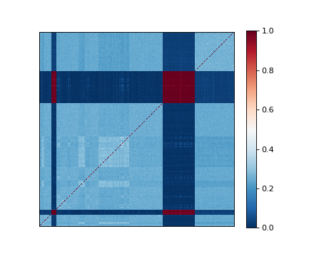
limix_plot.kinship(K, nclusters=1, img_kws=None, ax=None)[source]¶ Plot heatmap of a kinship matrix.
Parameters: - K (2d-array) – Kinship matrix.
- nclusters (int, str, optional) – Number of blocks to be seen from the heatmap. It defaults to
1, which means that no ordering is performed. Pass"auto"to automatically determine the number of clusters. Pass an integer to select the number of clusters. - img_kws (dict, optional) – Keyword arguments forwarded to the matplotlib pcolormesh function.
- ax (matplotlib Axes, optional) – The target handle for this figure. If
None, the current axes is set.
Example
>>> import limix_plot as lp
>>>
>>> K = lp.load_dataset("kinship")
>>> lp.kinship(K)
Manhattan plot
-
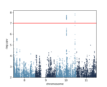
limix_plot.manhattan(data, colora='#5689AC', colorb='#21334F', pts_kws=None, ax=None)[source]¶ Produce a manhattan plot.
Parameters: - data (DataFrame, dict) – DataFrame containing the chromosome, base-pair positions, and p-values.
- colora (matplotlib color) – Points color of the first group.
- colorb (matplotlib color) – Points color of the second group.
- pts_kws (dict, optional) – Keyword arguments forwarded to the matplotlib function used for plotting the points.
- ax (matplotlib Axes, optional) – The target handle for this figure. If
None, the current axes is set.
Example
>>> import limix_plot as lp
>>> from numpy import log10
>>>
>>> df = lp.load_dataset('gwas')
>>> df = df.rename(columns={"chr": "chrom"})
>>> print(df.head())
    chrom     pos       pv
234    10  224239  0.00887
239    10  229681  0.00848
253    10  240788  0.00721
258    10  246933  0.00568
266    10  255222  0.00593
>>> lp.manhattan(df)
>>> plt = lp.get_pyplot()
>>> _ = plt.axhline(-log10(1e-7), color='red')
>>> _ = plt.ylim(2, plt.ylim()[1])
Normal plot
-
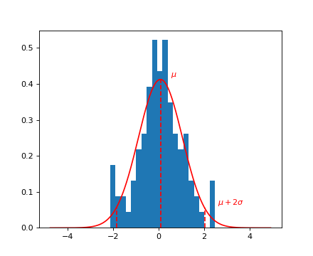
limix_plot.normal(x, bins=20, nstd=2, ax=None)[source]¶ Plot a fit of a normal distribution to the data in x.
Parameters: - x (array_like) – Values to be fitted.
- bins (int, optional) – Number of histogram bins. Defaults to
20. - nstd (float, optional) – Standard deviation multiplier for drawing a dashed line.
- ax (matplotlib Axes, optional) – The target handle for this figure. If
None, the current axes is set.
Example
>>> from numpy.random import RandomState
>>> import limix_plot as lp
>>>
>>> random = RandomState(10)
>>> x = random.randn(100)
>>> lp.normal(x)
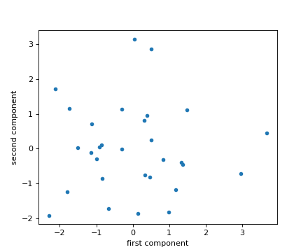
PCA plot
-
limix_plot.pca(X, pts_kws=None, ax=None)[source]¶ Plot the first two principal components of a design matrix.
Parameters: - X (array_like) – Design matrix: samples by features.
- pts_kws (dict, optional) – Keyword arguments forwarded to the matplotlib pcolormesh function.
- ax (matplotlib Axes, optional) – The target handle for this figure. If
None, the current axes is set.
Example
>>> import limix_plot as lp
>>> from numpy.random import RandomState
>>>
>>> random = RandomState(0)
>>> X = random.randn(30, 10)
>>> lp.pca(X)
Plot an image
-
limix_plot.image(file, ax=None)[source]¶ Show an image.
Parameters: - file (file-like object, string, or pathlib.Path) – The file to read.
- ax (matplotlib Axes, optional) – The target handle for this figure. If
None, the current axes is set.
Example
>>> import limix_plot as lp
>>>
>>> file = lp.load_dataset("dali")
>>> lp.image(file)
>>> file.close()

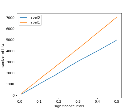
Power plot
-
limix_plot.power(pv, label=None, alphas=None, pts_kws=None, ax=None)[source]¶ Plot number of hits across significance levels.
Parameters: - pv (array_like) – P-values.
- label (string, optional) – Legend label for the relevent component of the plot.
- alphas (array_like, optional) – Significance thresholds for which the number of hits is defined.
Defaults to
numpy.linspace(0.01, 0.5, 500). - pts_kws (dict, optional) – Keyword arguments forwarded to the matplotlib function used for plotting the points.
- ax (matplotlib Axes, optional) – The target handle for this figure. If
None, the current axes is set.
Example
>>> import limix_plot as lp
>>> from numpy.random import RandomState
>>>
>>> random = RandomState(1)
>>> nsnps = 10000
>>>
>>> pv0 = list(random.rand(nsnps))
>>> pv1 = list(0.7 * random.rand(nsnps))
>>>
>>> lp.power(pv0, label='label0')
>>> lp.power(pv1, label='label1')
>>> _ = lp.get_pyplot().legend(loc='best')
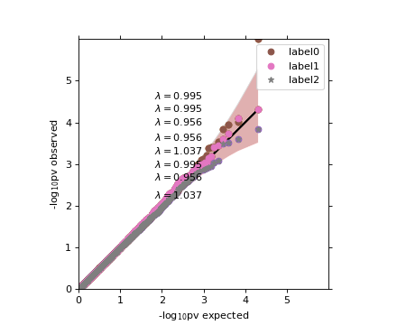
Quantile-quantile plot
-
limix_plot.qqplot(a, label=None, alpha=0.05, cutoff=0.1, line=True, pts_kws=None, band_kws=None, ax=None, show_lambda=True)[source]¶ Quantile-Quantile plot of observed p-values versus theoretical ones.
Parameters: - a (Series, 1d-array, list) – Observed p-values.
- label (string, optional) – Legend label for the relevent component of the plot.
- alpha (float, optional) – Significance level defining the confidfence interval. Set to
Noneto disable plotting. Defaults to0.05. - cutoff (float, optional) – P-values higher than cutoff will not be plotted. Defaults to
0.1. - line (bool, optional) – Whether or not plot a straight line. Defaults to
True. - pts_kws (dict, optional) – Keyword arguments forwarded to the matplotlib function used for plotting the points.
- band_kws (dict, optional) – Keyword arguments forwarded to the fill_between function used for plotting the confidence band.
- ax (matplotlib Axes, optional) – The target handle for this figure. If
None, the current axes is set.
Example
>>> import limix_plot as lp
>>> from numpy.random import RandomState
>>>
>>> random = RandomState(1)
>>>
>>> pv0 = random.rand(10000)
>>> pv0[0] = 1e-6
>>>
>>> pv1 = random.rand(10000)
>>> pv2 = random.rand(10000)
>>>
>>> lp.qqplot(pv0)
>>>
>>> lp.qqplot(pv0)
>>> lp.qqplot(pv1, line=False, alpha=None)
>>>
>>> lp.qqplot(pv1)
>>> lp.qqplot(pv2, line=False, alpha=None)
>>> lp.box_aspect()
>>>
>>> lp.qqplot(pv0, label='label0', band_kws=dict(color='#EE0000',
...           alpha=0.2));
>>> lp.qqplot(pv1, label='label1', line=False, alpha=None);
>>> lp.qqplot(pv2, label='label2', line=False,
...           alpha=None, pts_kws=dict(marker='*'));
>>> _ = lp.get_pyplot().legend()
Comments and bugs
You can get the source and open issues on Github.